Local Haze application for iPhone by HumanLogic, displaying air quality sensor confidence ratings. Available for free on the Apple App Store.
INDUSTRY
Air quality monitoring
PRACTICE AREAS
Product Planning, Concepting, Product Management, UI/UX for native mobile app, Interaction Design, Agile Development, Marketing
PROJECT
Design and launch an iPhone application displaying real-time local air quality sensor data and associated sensor confidence ratings, a new and innovative approach to sensor data accuracy.
SUMMARY
Led highly collaborative agile approach to product planning, designing, building and launching a data-centric iPhone application displaying data from global connected air quality sensors.
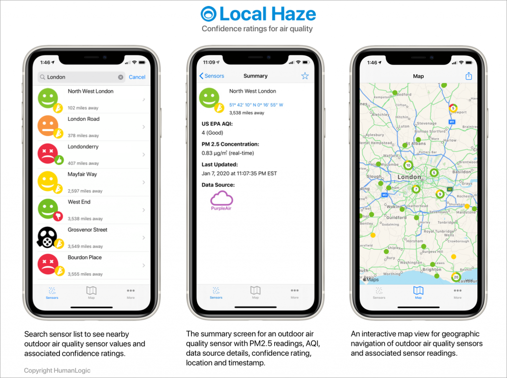
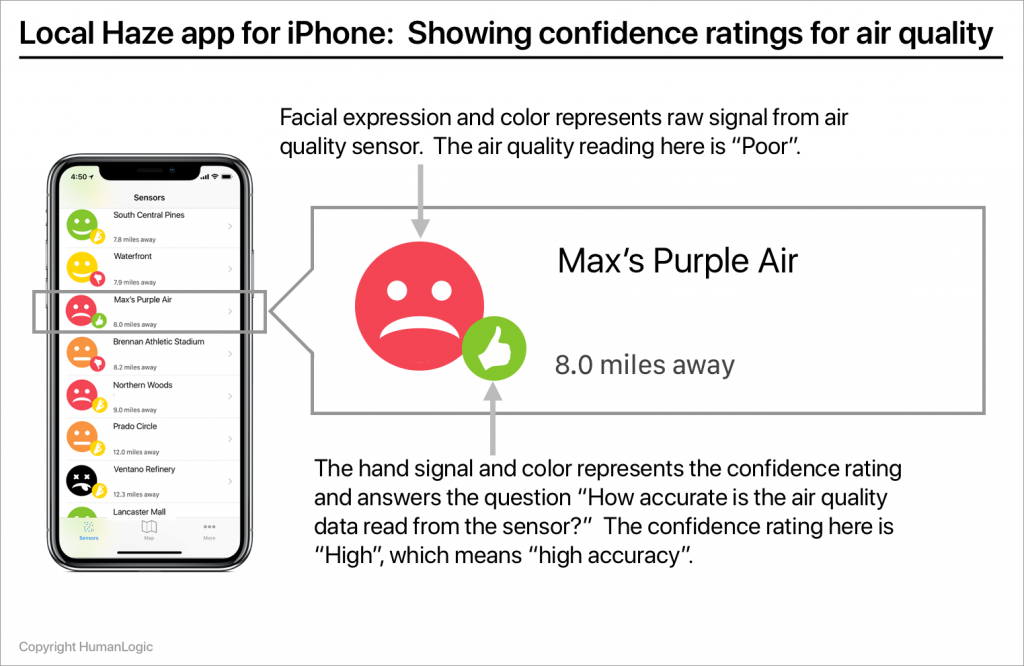
Designed a simple “at-a-glance” user experience for understanding readings from air quality sensors and the associated heuristics and presentation of confidence rating for each instance of sensor data.
Led Go to Market for product, launched application in the App Store, delivered a marketing site and marketing channels for the product.
PROCESS
How confident are you in the readings of air quality sensors around you? How would you know if they are inaccurate or reporting incorrect data?
The EPA and the WHO have established guidelines for safe air quality, and health risks resulting from poor air quality, pollutants and the presence of particulate matter (PM) are well known. Yet although there are many air sensors monitoring the quality of the outside air, until now there has been no easy to use tool to allow consumers to understand the accuracy of local air quality measurements.
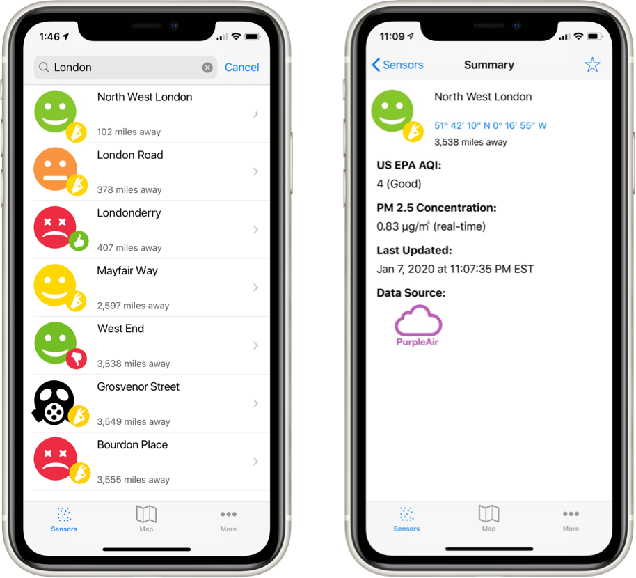
Local Haze solves this problem by delivering accuracy data in the form of confidence ratings for air quality readings from local outdoor air sensors. Local Haze aggregates quality-controlled crowdsourced air quality data and public air quality data and delivers an easy to understand sensor reading confidence value delivered to any iPhone. In a few seconds a sensor’s reading and a confidence rating in that reading can be easily understood “at-a-glance” via a user experience understandable by a wide range of consumers. More detailed data about sensor readings is available with a tap.
BACKGROUND
With Local Haze the HumanLogic team set out to design an experience for presenting a quantitative data source — in this case air quality — in an easy to understand format that does not require the user to possess heavy quantitative skills. We wanted to see if it was possible to design a qualitative experience, even an emotional one that could abstract the underlying quantitative data into an easily consumable “on-the-go” experience. We were also curious as to whether a design solution could be found to deliver an air quality reading experience that a typical consumer would consider trustworthy.
Trust is important in data-centric experiences. Some of my our work has been challenging because we have been tasked with delivering good user experiences in situations where the underlying data is inaccurate, or its accuracy is questionable. Perceived inaccuracy of data does not help build trust with users — it often leads to distrust.
In this project, we aimed to address some of the challenges of perceived data uncertainty while trying to improve the heuristics that lead to increased “data confidence” for the end user.
In terms of technical approach, Local Haze validates the outdoor air quality data for a user’s location by crowdsourcing publicly available air quality data and then applies a rating to the validation data. The app then displays this rating in an easy to understand user experience delivered to a device, so that the user can determine their confidence in the data they are seeing.
REQUIREMENTS AND FEATURES
We began the design process by defining and prioritizing requirements for the Local Haze app using Agile development methods, defining use cases, writing user stories and elaborating on features for the MVP version of the app. We used Bitbucket to maintain the backlog of stories, and prioritized development into sprints. While documenting near term features we also included the roadmap of intended features over the next 18 months. We believe this approach to planning allows avoid designing user experience solutions that do not scale and enable adaptation when requirements change.
The primary use case for Local Haze is home use allowing a connected consumer to rapidly view confidence ratings and summary data for local outdoor air quality. A secondary use case, allowing search for a specific location did not make it into the MVP but was placed into the backlog and prioritized for a later release.
We defined one user persona — an Air Quality Enthusiast. This persona featured such characteristics such as a high degree of motivation to track air quality through public environmental data sources and a tendency to purchase home air quality tracking devices connected to a home network. The requirements included an easy-to-understand view of the air quality data and associated confidence as well as the ability to drill down and see the technical details of the data.
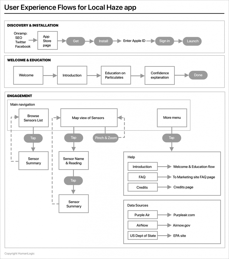
FLOWS AND DATA MODEL
The next step was to work with Engineering on the definition of the data model and define the use cases and flows to support the persona. Our use cases were modeled around browsing sensor data at the collection level and then drilling down into specific sensors. Although the app is free for its initial (MVP) release, we also modeled future features for including “in app purchase” of specific types of data and analytics.
The primary flows for the MVP release (not including error flows) of the Local Haze app include:
· An onboarding experience to drive knowledge about air quality readings, introduce the concept of confidence ratings and encourage discovery.
· Launching the app to see a collection of nearby sensors, the default view and associated drilldown interaction.
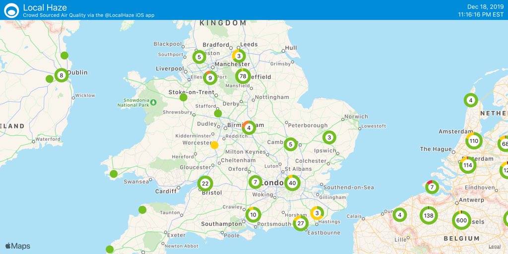
· Displaying a geographic view of the sensors on a map with active pins and associated gestures for map interaction and drilldown.
· Drilling down to view a summary view of a specific sensor’s data.
We focused on defining a data model for the MVP release that expressed the available data from the portfolio of air quality sensors and would allow us to meaningfully show uncertainty in a mobile experience. We defined a site object mapped to a single data source and associated with one or more sensors. This flexibility reflects that some of the sensors (such as the Purple Air sensor) feature redundant sensors associated to a single site, thus provising an additional measure of accuracy.
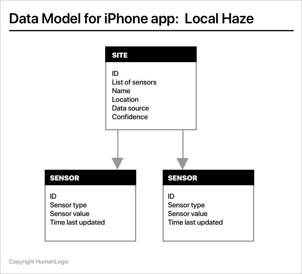
Air quality measurements are commonly reported in terms of micrograms per cubic meter (µg/m3) parts per million (ppm) or parts per billion (ppb), so we needed to be able to present this information in qualitative ways that made sense but enabled an Air Quality Enthusiast to drill down to the technical details if needed.
The air quality sensor data for the Local Haze utilizes APIs from PurpleAir, Luftdaten, AirNow and the U.S. Department of State.
WIREFRAMES AND MOCKUPS
Working iteratively, we produced early mockups to determine visualizations of the air quality sensor data that most clearly reflected the status of the sensors in an easy to understand format. Some of the initial mockups included placing actual numerical sensor values on the browsing screen — the list of sensors — an approach that was not included in the final design because it was seen as being too complicated for a consumer user to quickly understand.
Overall app navigation design originated as a tab control at the top of the screen to filter the view of the collection of sensors and a hamburger menu to access other major app areas. This approach felt clunky and involved gestures that required too much screen traversal with the thumb.
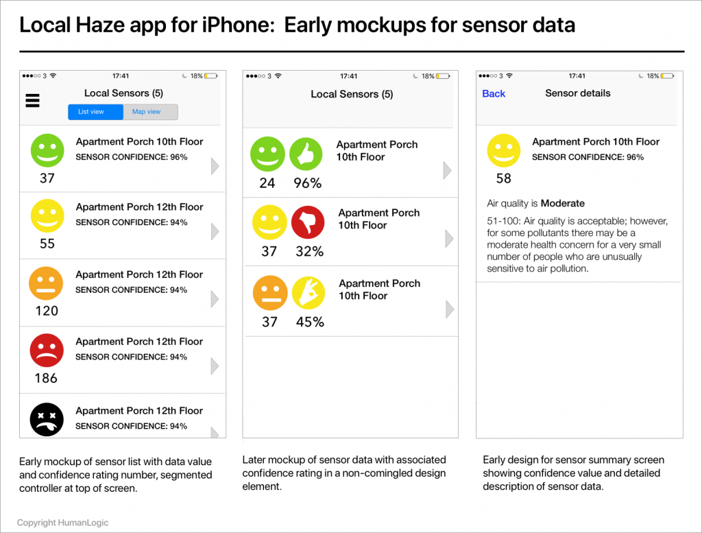
The final design using a tabbed navigation controller at the bottom of the screen, an approach that facilitated easier single handed user interaction. The wireframes reflected requirements for aggregated sensor views and summary views and as drilldown screens for each sensor. The wireframes helped to reflect the MVP requirements in a format that enabled the team to analyze the designs and provide feedback.
BRANDING AND VISUAL DESIGN
Visual design and branding commenced during the early stage of the design process. Since the sensor data is drawn from devices all over the world, one of the design goals included reducing the reliance on words and instead using iconography and numerical values in the core user experience. The color palette was designed to answer brand attributes such as “trustworthy”, “simple”, “accurate” and “vibrant”. It was a design decision to reduce clutter on the Sensors list and instead display more detailed sensor data using drilldown interaction and a summary screen for each sensor. An early version of the app’s visual design language (since updated in late 2019) is shown below.
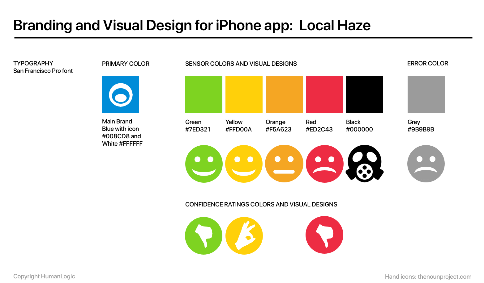
One of the visual design challenges was how to design a layout for the sensor reading data so that it could be co-mingled with the confidence data, and to have this “read” in the UX as a single composite data element. Multiple iterations of design resulted in the final design of a UI element that visually combines the sensor value and confidence rating into a composite element that works well with the display constraints of a mobile device.
INTERACTION MODEL
The interaction model for Local Haze is based around a single-handed “launch and view” experience — designed to minimize user interactions while quickly presenting rich and useful information “at a glance”. Launching the app should immediately present the most critical information and it should be easily accessible — without any need for interaction.
Part of the design intent for the interaction model for Local Haze includes enabling a good single-handed user experience. It is also assumed that single-handed use of the device would be typical for browsing collections of sensors via the scrolling gesture using the thumb. Drilldown on the sensor collection utilizes the tap gesture to view a summary of sensor data. Navigation among the core app areas utilizes a segmented controller UI component placed at the bottom of the screen and this was intentional to facilitate single-handed use.
Performance is an important issue in the Local Haze user experience, since accessing and preparing the sensor data can be a challenge. We did experience some challenges with performance in the app, especially on first use when sensor data is being loaded into the app and we used techniques such as “lazy loading” to improve the perceived speed of the user experience. We also had to correct some of our map scaling techniques to allow performance in situations with many sensors to be rendered on screen.
ROADMAP FEATURES
With each release of Local Haze, features in the backlog are reviewed and prioritized for release. After the initial launch, we have published release notes that document updates and often thank our users who write to us to request new features and updates. For our release version 1.2 we added Luftdaten sensors and a feature to allow users to “pin” favorite sensors. In July of 2019, a version 1.3 release included a 40% increase in the total number of crowdsourced sensors, a new feature to share sensor maps via social media (Twitter, Instagram, Facebook, etc) and also updated icons for air quality readings.

BUSINESS RESULTS
The HumanLogic team conceived of and delivered the Local Haze app as an independent project. We used collaborative product design and development processes to enable delivery of a new and innovative mobile app for iPhone, using publicly available APIs for air quality data.
After a February 2018 soft launch in the Apple App Store, Local Haze is slowly building up an audience of air quality enthusiasts. Ratings are being posted on the App Store and initial reaction is very positive (all ratings so far are 5 stars). Success continues to be measured on the rate of adoption and engagement of the app, and we are using analytics to track this data. The next phase of work includes gathering user feedback and user research efforts to test users’ comprehension and the trustworthiness of the confidence ratings.
Although after the initial launch the app required some tweaking when one of the sensor APIs was changed, we adapted the code to accommodate the update and posted changes to the App Store. In a recent release, we have had to address issues with map performance during pinching and zooming across large geographic areas.
Concurrently to the initial app launch, we launched and continue to maintain a marketing site for the Local Haze app. Visitors to the marketing site have shared positive feedback in particular the availability of a detailed FAQ explaining the “why” behind the app and the sources of data that Local Haze uses.
In addition, we also launched a social media program for Local Haze including a Twitter feed that features frequent postings of global air quality sensor confidence ratings using the new Share feature for sharing sensor maps. Air quality enthusiasts and manufacturers of air quality sensor and other related products are among the followers, and the feedback and engaged discussion has led to requests for new features which we have included in our releases. The Local Haze Twitter feed can be viewed using the @localhaze handle or at: https://twitter.com/localhaze
FOR MORE INFORMATION
For more information on how HumanLogic can help with designing and improving your digital products please visit https://www.humanlogic.com
For more information on Local Haze please visit the Local Haze marketing site or visit the App Store to download Local Haze for free. Your feedback about Local Haze is welcome at [email protected].
Credits:
Apple and iPhone are trademarks of Apple Inc., registered in the U.S. and other countries. App Store is a service mark of Apple Inc., registered in the U.S. and other countries.
All contents Copyright HumanLogic