You’re a startup founder with a new product concept. Realizing your idea with the least risk involves validating your product idea before building it. To do this involves designing a prototype and gathering customer feedback to fine-tune the product. Though you might be familiar with the term “user experience” or “UX,” you may not have any background in the discipline. You may be asking, “What does the user experience do for my product?”
What’s important about UX?
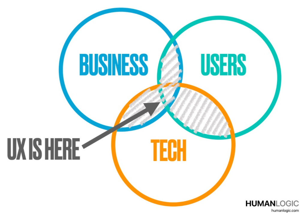
User experience exists at the intersection of the needs of the business, the users’ needs and technology capabilities – and is a continual balancing act between all of these dimensions. A poor user experience damages customers’ perception of your product and can grind your business model to a halt. Your product’s user experience should function like a well-oiled machine, driving user behavior that enables your business model to flourish.

For some products – for example, SaaS – the user experience is critical because it is the product’s brand – and vice versa: the product’s brand is the user experience. The entire SaaS product lifecycle occurs within the context of the user experience.
For some products, the user experience is critical because it is the product’s brand – and the product’s brand is the user experience.
Karen Donoghue, HumanLogic
As an experienced user experience practitioner with many years of experience in early-stage companies, I have seen founders struggle to decide how to architect the user experiences for their products while attempting to find Product-Market Fit (PMF). Here’s advice from lessons learned over many years of designing and deploying products into the market for this specific issue. My partner and I write in more detail about this in our book focused on UX for founders.
Architect for flexibility
If you are still investigating business models and seeking PMF, design a product architecture to enable flexibility in the user experience that allows for strategic selling and investigation of potential partnerships. I often see founders architecting primarily for scale (e.g. the number of end-users), though being flexible and enabling business partnerships with your product’s technology can help you find a good market fit.
From a UI perspective for your product offering, you will want to consider going with full branding, minimal branding, or a strategy somewhere on the continuum between these two. It will be important to remain flexible about this, depending on how your business model evolves.
Understand where your PMF occurs along the continuum
Your search for PMF will force you to contemplate where your product’s user experience will live along this continuum. You’ll have to answer whether your product is a standalone, independent brand, an enabling technology, or something in between.
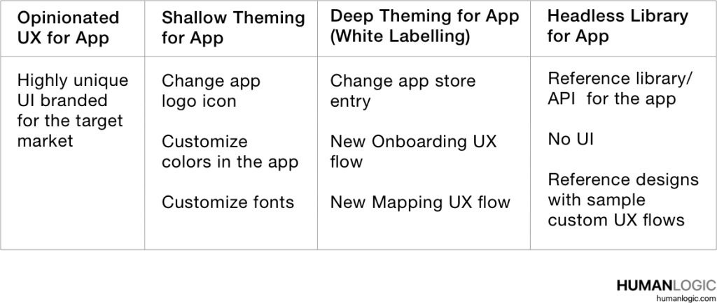
For example, consider an “Opinionated UX” at one end of this continuum – a product with a strong and unique point of view in terms of user experience and branded for a specific market. A good example is an app that will exist as an independent brand – see the column at the far left in the table below.

At the other end of the continuum – the column at the far right of the table – might be a heavily customizable product offering consisting of a set of libraries without a UI (also called “Headless Library”). This Headless Library might include a well-documented API and a few sample applications – known as “reference designs” – that showcase how to use the library and/or APIs to enable custom UX flows for an application. This is an example of an “enabling technology” product offering.
In between these two endpoints sits a variety of UI customization techniques known as “theming” – which can range from “Shallow Theming” (customizing the look of the UI colors, backgrounds, icons, fonts, etc.) to “Deep Theming”, involving customization of both the look and the application flow, perhaps also affecting the app’s the interaction model.
Opinionated UX vs. Headless Library
If your product is a standalone, independent brand, leaning more toward the Opinionated UX approach is better. If your product is an enabling technology and going to market through partnering, from an architectural perspective, leaning towards the Headless Library approach ensures that your product is easy to integrate and can be used as a base technology to easily and quickly deliver a branded (or co-branded) experience.
Let’s say your product is a consumer app available by subscription with unique enabling technology and a high-quality user experience. A large brand name company is interested in licensing your underlying technology but is not interested in the product’s user experience “as is”. Perhaps the company is also demanding to substantially adapt the UX flows. To obtain a licensing agreement, you will need your product to allow for an option somewhere in the middle of the theming continuum, the extent of which will be determined by the UX customizations required by the brand licensing your technology.
If you take the Headless Library approach, developing a few exemplary reference designs will help showcase your product’s unique capabilities and ease of customization. For an enabling technology product offering, showcase its flexibility and ease of integration through reference designs. These reference application examples help prospective customers envision what’s possible with your product and how it will enhance their business results, helping to facilitate sales and business development discussions.
About the author
Karen Donoghue is a Principal at HumanLogic and is the co-author of the book “Envision Product: User Experience for Founders” (2021), written with Craig Newell. Karen works with clients large and small and has a history of helping clients validate and translate requirements into effective new user experiences that satisfy business goals and customer needs.
HumanLogic has completed successful projects for corporate clients, including Google Chrome OS, VMware, T-Mobile, Olympus, SecurityScorecard, Imprivata, The Associated Press, and many early and later-stage startups.
Karen has designed MVPs that have produced significant impact, including the UX for Resilient Systems, a startup acquired by IBM Security. She also serves as an Advisor to SecurityScorecard (NYC, USA) and Turivius (Brazil). Karen has also been an advisor to the founders of MetaCarta (a startup acquired by Nokia) and to the Tufts University Department of Computer Science. Karen earned an MS from the MIT Media Laboratory in Boston.
For more information
For more information about this topic, please see Envision Product: User Experience for Founders” (2021), written by Karen Donoghue and Craig Newell from HumanLogic. For more information about HumanLogic’s user experience practice and to review case studies, please visit the HumanLogic website.